The Effects of Gacha Games on Player Behavior and Spending
This page uses a simple dataset to show how different gacha player types vary in playtime, spending, pulls, and satisfaction. The charts support a narrative that increased engagement often comes with higher spending, but not necessarily higher satisfaction.
Chart 1: Monthly Spending by Player Type
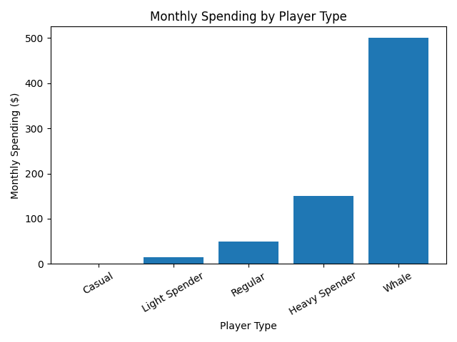
This bar chart shows that spending rises sharply as players move from casual participation to whale-level engagement. It is effective because the categories are easy to compare side by side, making the financial imbalance in gacha participation immediately visible.
Chart 2:Weekly Hours Played vs Monthly Spending
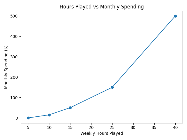
This line chart suggests a relationship between time investment and money spent. As players spend more hours in the game, they often spend more money as well. The chart is effective because it emphasizes the upward trend and helps show how longer engagement can lead to higher financial commitment
Chart 3:Spending vs Satisfaction
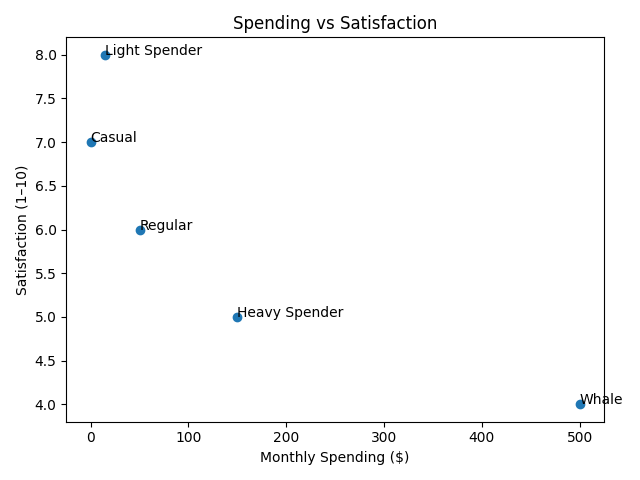
This scatter plot shows that higher spending does not necessarily create higher satisfaction. In this dataset, satisfaction drops as spending increases, which supports the argument that gacha systems can produce financial pressure without improving the player experience. The chart is effective because it reveals a relationship that is less obvious in simple category comparisons.
Overall, the dataset suggests that gacha games can encourage both time investment and spending, but higher spending does not guarantee a better experience. This makes gacha systems effective at generating engagement, while also raising concerns about financial and psychological impact.